Ellsi
Let's create a way to present notifications and content with empathy— through a multi-modal voice experience— in a world where notifications are becoming more and more toxic.
Timeline
- Conducted User Research (contextual inquiries and interviews) in the psychological effect of notifications with fellow students I recruited
- Researched goals, emotions, and consciousness, individually, and how to apply that to technology under academic faculty from a Philosophy of the mind perspective
- Developed hi-fidelity prototypes, individually, with Front-End technologies
- Conducted conversational, interaction, visual, and UX Design refresh for iOS
Prompt
Distill problems discovered in Artificial Intelligence and notifications through User Research and Philosophical Research into a design and prototype of a People-First way to read, manage, and interact with notifications.
Strategy
Building a Research-Driven and User-Centered Voice UX
- Assemble and Lead a Research-Driven Team
I recruited and guided a multidisciplinary team to conduct in-depth user research. Our goal was to uncover pain points, gaps, and opportunities, using a combination of classical research in AI and Philosophy of the mind techniques and iterative UX methodologies in and out of the field. By centering the user in every decision, we ensured a data-driven foundation for identifying whether a Voice UX solution was truly the right path forward. - Prototype with Precision and Intent
When the research indicated the need for prototyping, I led the creation of scaled-down prototypes aligned with a "test small, learn fast" approach. This phase incorporated rigorous usability testing cycles, adhering to mobile-first, universal design principles, and an evolving brand identity. The process ensured that every interaction reflected both accessibility and customization derived from user insights, balancing design innovation with practicality. - Implement a Holistic Voice Strategy
I directed the design and execution of a comprehensive voice strategy once a Voice Interface emerged as the optimal solution. This strategy integrated the six key steps of Voice UX design—requirements definition, high-level design, detailed design, development, testing, and tuning—tailored to the unique needs of the users and the business. While the original concept was a notification management platform, I pivoted to a Voice UX assistant by systematically evaluating user scenarios and ensuring the design addressed both functional and emotional user needs. - Use Reverse Brainstorming to identify potential roadblocks in Voice UX, mapping out worst-case scenarios and addressing them proactively.
- Conduct Jobs to Be Done (JTBD) interviews to frame the user's true goals and align business objectives with Voice UX solutions.
- Run a Lightning Decision Jam to collaboratively outline the voice persona, tone, and key dialog flows.
- Use Crazy Eights to quickly ideate on dialog strategies, grammar types, and branding nuances in voice interactions.
- Develop Storyboard Scenarios to visualize user journeys and align dialog flows with real-world context.
- Apply Dot Voting with stakeholders to prioritize design elements based on user feedback and research findings.
- Incorporate Wizard of Oz Testing, where users interact with a simulated voice system to uncover usability issues early.
- Integrate Design System Thinking to align Voice UX components with universal brand standards, ensuring consistency across touchpoints.
- Use Parallel Prototyping to compare different design approaches simultaneously and choose the most effective.
- Conduct 5-Second Tests for first impressions of voice prompts and phrasing.
- Facilitate A/B Testing to refine error-handling strategies and voice tones.
- Use Heuristic Evaluations focused on conversational flow and user empathy.
- Establish Continuous Discovery Habits by gathering user feedback post-launch and using analytics tools like Google Analytics for voice performance tracking.
- Apply Affinity Mapping to synthesize qualitative feedback into actionable improvements.
- Use Task Analysis to measure how effectively users achieve their goals with the voice assistant and refine the UX accordingly.
6 Steps to Exceptional Voice Interface Design
| Step | Preview | What | How |
|---|---|---|---|
| 1. Requirements Definition | A VUI bridges user comfort and business priorities through innovation. | Define the business motivation and align with user and application goals. | |
| 2. High-Level Design | Set the stage for seamless interaction with a brand’s voice. | Establish dialog strategy, grammar type, and persona alignment. | |
| 3. Detailed Design | Focus on research-backed scenarios to ensure user satisfaction. | Craft precise dialogs and tailored prompts for all use cases. | |
| 4. Development | Blueprint to reality with precision and adaptability. | Integrate coding practices and backend systems. | Build iteratively with stakeholders under a shared vision. |
| 5. Testing | Rigorous testing ensures system reliability and trust. | Ensure the system operates as intended in real-world scenarios. | |
| 6. Tuning | Continuously evolve the VUI with user needs. | Optimize grammar, accuracy, and satisfaction through feedback. | Identify high-traffic patterns and refine processes. |
Challenges
Key Challenges Encountered in Voice UX Design
- Balancing Transparency, Consent, and Privacy in Health Metrics Research
Navigating the complexities of collecting and analyzing sensitive health data while maintaining user trust and adhering to strict ethical standards posed significant challenges. - Engaging with Searle’s Chinese Room Thought Experiment
Addressing the philosophical implications of artificial intelligence and countering skepticism around AI’s capacity for true understanding required thoughtful exploration and innovative thinking. - Starting Over Amid Evolving Resources and Technical Capabilities
Facing situations where projects had to be restarted from scratch due to advancements in technology or shifts in resources to remain adaptable and forward-thinking.
Response
Driving Innovation and Empathy in Voice UX Design
- Safeguarding User Insights for Ethical Research
I prioritized ethical design practices by ensuring that personal revelations, stories, and details discovered through contextual inquiries were managed anonymously. This approach safeguarded user trust and upheld privacy standards, allowing the team to focus on deriving actionable insights while respecting the users' vulnerabilities. These revelations became the foundation for designing solutions that were both empathetic and user-centric. - Advancing Empathetic Voice UX with Conscious AI
Leveraging my expertise in Voice UX and an understanding of philosophical debates, I explored how “Conscious AI” could contribute to more empathetic and human-centered experiences. By documenting potential pathways for empathetic AI integration, I developed a unique perspective that refuted John Searle’s Chinese Room argument. Drawing on existing counterarguments and crafting original responses, I laid the groundwork for a paradigm shift in designing AI that feels intuitive, relational, and contextually aware. - Navigating Setbacks and Embracing Iterative Innovation
Recognizing that not all projects come to fruition, I’ve guided teams through the reality of starting from scratch when technical capabilities or resources improved. This required fostering a culture of resilience and adaptability, enabling us to pivot effectively and reimagine solutions without being constrained by prior iterations. By viewing setbacks as opportunities, I led teams in producing refined and innovative outcomes. - Redesigning for Brand Evolution and Uniqueness
As brands evolve, so must their Voice UX strategies. I spearheaded the redesign and redevelopment of this voice experience that adhered to a suite of evolving design standards while maintaining a distinct and innovative identity. By harmonizing brand consistency with the unique needs of the voice platform, I ensured that the solutions stood out within the design standards and resonated with users in meaningful ways.
Solution
User Research
After conducting surveys with a diverse group of students exploring how they used technology, with their consent, I accompanied them in certain situations observing their interactions with notifications on their phones and computers all aiming to learn how notifications, and technology in general, manipulates users.
We (a team I had recruited) interviewed students, the campus counseling and psychiatric services, and off-campus services further seeking to learn more about technology and notifications' impact on millennials’ mental health. In addition, we interviewed older late middle-school, high-school individuals with their own and their parents’ consent to explore those that grew up in an age surrounded by the internet and technology. We learned, with anonymity, about the effect notifications have on human wellbeing including anxiety developed through anticipation of notifications over time to instances of ringtone hallucinations; for example, phantom vibrations. However while the impact of technology and notifications remained diverse as the groups we were exploring this impact with, an emerging sentiment was revealed where notifications and technology resembled stress, work, and labor whereas the desired or expected sentiment from technology was relief and entertainment.
To conclude our research, although what determined to be an equally important phase, we conducted contextual inquiries with our participants on breaks at their place of work, when they used their phones and had an opportunity to read received notifications (they were and were not anticipating), as well as in other locations in their life when given permission. When given consent, we measured their heart rate during these inquiries to determine a physiological effect when anticipating or receiving notifications.
We reached the conclusion that much of technology including that which may be built with user experience and empathy in mind, or so appears to be, actually has a pervasive, intrusive, addictive effect on the user in their everyday life. And while that gains more users or a cult following, it is detrimental to the wellbeing of the humans the technology should serve or at least be useful for in their lives.
Classical Research
While conducting the user studies summarized under User Research, I independently and individually conducted research in Artificial Intelligence from a philosophical and cognitive psychological perspective under supervision and later review of experts in the field. In doing so, reflecting on my readings and times studying consciousness from theistic, atheistic, and non-theistic perspectives, I wrote three papers (introduced in the page on my papers and presentations). My aim in doing so was to create a strategy reflecting on consciousness’ evolution and from that create a methodology and techniques for technology to be a more Human-Centered and empathetic experience unlike that which was shown in the User Research. To promote and benefit the user and gain a genuine, non-cult following. I did this by exploring behavior, goal creation, and drive towards goal achievement and reflected on the pathways manipulated in the user—perhaps even a weaponizing of natural drives. Whereas my aim was empathy and compassion from the technology itself, I then sought to explore levels of consciousness and their evolution from sentience onwards across species and through evolution. Through both of these, I developed a system and formula to afford a natural drive in technology, to be more empathetic, through accomplishing its goals of serving the user.
Prototyping
After concluding these two phases of research, I began prototyping practical implementations of my research in software as well as interface concepts and experience elements for an assistant. I believed other than a set of techniques by which to build more Human-Centered technology, which was also developed, a system to check notifications in a more relevant, contextual manner, to the users' wants and ambitions not manipulating instinctive drives, was needed, as per the research. Between 2013 and 2016 there were no phases of iterative prototyping, design, and testing as I was restrained by intellectual property and no-compete agreements. However, when I was intellectually free and legally able, I built a hi-fidelity prototype featuring more interactions and a complete experience designed to serve relevant notifications with empathy so as to empower and promote the user, the human, in their life.

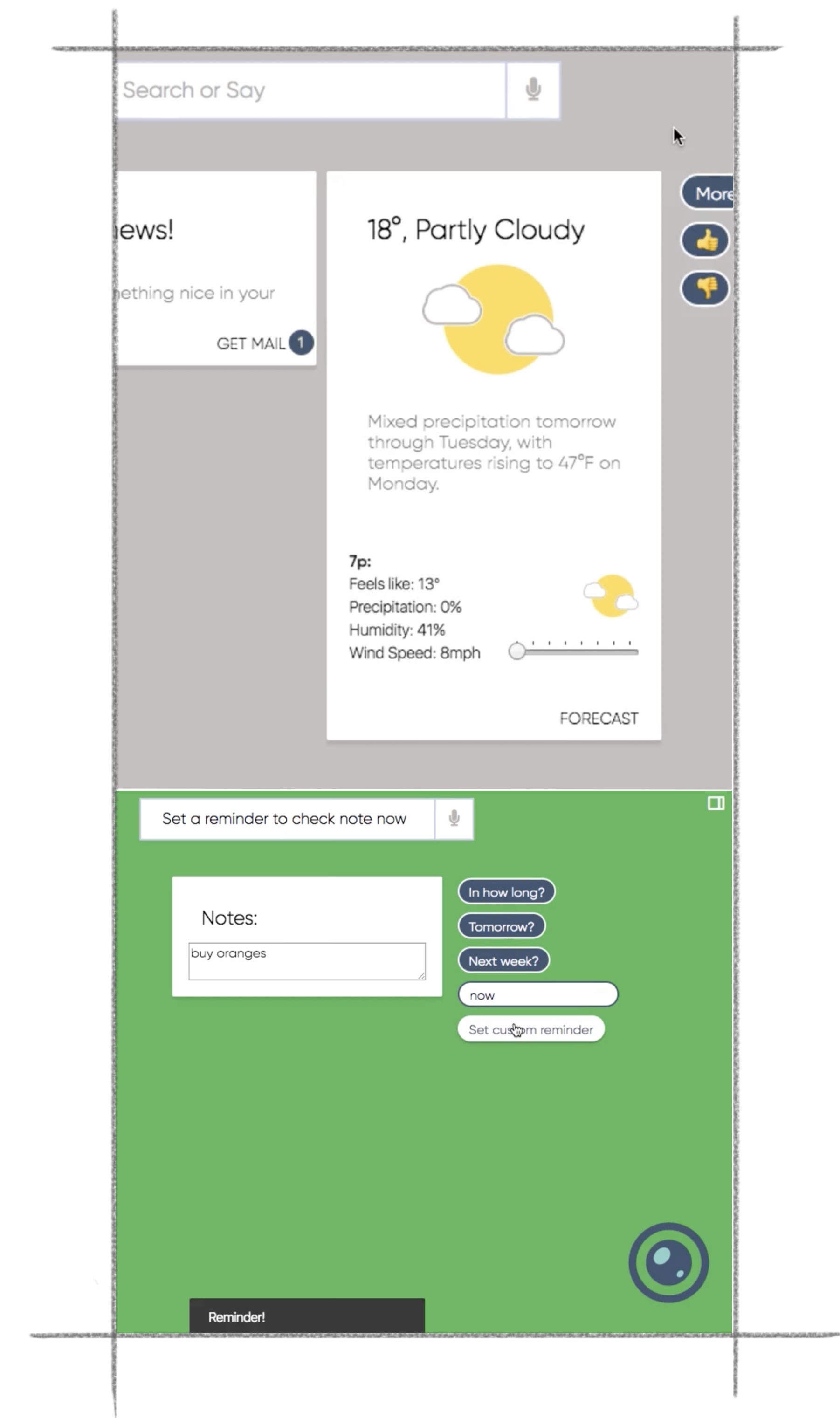
A key element of these prototypes were an implementation of artificial emotions to recreate drive and purpose for the user and their goals as explored in my papers. For some more on this and how the papers relate to Ellsi, I am happy to give a high level overview.
Voice UI Design
When I decided from my research that I wanted to build an Artificially Intelligent way to manage notifications in a more People-First manner, I began designing an assistant. In the conversational design process, I wireframed different layouts, dialog call flows, and brand elements. I believe brand elements were something to take seriously as the proper indicators, colors, and sounds are critical to the user’s participation and interaction with the Voice UI. Indicators, such as the proper listening sounds that I worked on, are important because they set up the user’s expectations and when that expectation is properly met with empathy and correspondence from the VUI, one has built an enriching voice experience. These same brand elements, and others, were critical in affording accessible and usable error states in case interaction was hindered or not recognized in some way.
13 sounds were tested with participants in person and remotely with a simple audio player interface and they were asked corresponding questions. These sounds, designed in Logic Pro and Adobe Audition, represent a variety of themes, moods, and uses in a voice interface and not. Particpants were asked to associate words to what they were hearing and those were aligned into common themes. Afterwards, similar "compositions" building on the sounds to be used in the interface (snackbar, alerts, dimissal, error, calls, delighters for example) were demo'd to build on earlier particpant feedback to original sounds of those types. These following sounds are 2 sounds used in the functional Ellsi prototypes after this research.
While speech recognition has become more more advanced with deep learning that does not entail speech comprehension has as well.
And, lastly, I spent such effort on branding, initially; including for example onomastic research with names, is because “There is no such thing as a voice user interface with no personality.” -Cohen, Giangola, and Balough. While in some regard it is inappropriate to anthropomorphize AI, it is almost necessary in VUI, to a certain degree, as we talk best with those we perceive as our peers. We’re perhaps overly formal with some and overly informal with others. The prototypes went through major design changes; however, the redesign that is included in this story is, also, meant to communicate and express the brand and friendliness we hope to come across with Ellsi—essential in expressing the message of the VUI (Ellsi being empathy) beyond the original concept of question answering. The personality implemented in Ellsi is meant to be friendly and human-like, not to trick the user to believe they are talking to a friend, but collect as much answer to question information as effectively and efficiently as possible while maintinging a conversational tone. The metaphor of a Ellsi is an assitant and therefore it talking in a knowledgeable but impersonal tone. I switched between using human recorded audio for its voice and speech synthesis to better convey the "brand" and the recordings mapped to common queries were effective in storytelling the persona of Ellsi. "Consistency of the user's experience with the [voice] interface depends in part on a consistent persona."
It seems it is natural, based on our own bias/experiences, we make assumptions from hearing a voice. As a designer, I've worked a lot with the psychology and, subliminal and overt, meanings behind colors, text, brands, and other experiential elements. However in designing a VUI, a strategy I've learned with Ellsi is that the voice experience—the tone, how it speaks to the person, how it serves the person, and how it affords their interaction and allows their goal completion is critical. It is important to consistently and critically remind ourselves to design an empathetic experience to help serve the user and eliminate any assumptions one might have of the voice with the helpfulness of the voice.
"People can more easily relate to...an experience when they are able to connect with it on a personal level" -Don Norman, Emotional Design
Lastly, what the goal of most Voice User Experiences is not to create conversations, but map user commands to voice requests (paraphrase). A way to interpret this is that we have to design for vocal communication and not spoken written communication. I aim to share that in the call flows.
Dialog Call Flows
This traditional dialog flow diagram details the path taken for new and seasoned users as they interact with preemptive cards and then get to the main conversation dialog state
Conversational Dialog Call Flows
Notice the focus on contextuality with the ecosystem and the user along with emphasis on privacy and the use of cards as well as a conversational interface when conversation is more intuitive or appropriate or the visual interface when otherwise.
User: “Ellsi, add turmeric, cardamom, and chili powder to my shopping list.”
Ellsi: “I’ve added those three for you.”
[Displays shopping list with three newest items on top]
Ellsi: “Would you like me to remind you when you’re at a particular store?”
User: “Yes, that would be so helpful!”
Ellsi: “Which store? Or search for it in the following card: ”
[Displays map card]
Response option A.) *User speaks location*
User: Fresh Thyme on Grandview ave.
Ellsi: “I’m setting the location reminder.”
Ellsi: If closer location, “I happened to find a closer location you have been to before, would you like directions and a reminder there?”
User: “No, thank you. I’m heading to that part of town.”
Ellsi: “Sounds good!”
Response option B.) *User searches location*
[Displays list of closest matching results]
[User selects location]
Ellsi: “I just set the reminder.”
Here we see a callout to interact with the hybrid/multi-modal interface, but have the ability for hands-free, eyes-free use.
While multi-modal interfaces are an evolution of traditional Voice Design, as visual interfaces have become nearly compeltely common, they offer the ability for the Voice interface to become robust. With a self service option, we can extend the brand and improve reach to meet customers where they are, humans where they are—comfortable; and even uncomfortable with intelligence, uncomfortable solving new problems where they arise in the moment. Empowering the customer, completing the brand, bridging the device as core to the product ecosystem.
Additionally because the user is signed in, we are able to leverage a mixed initiative system to collect different data points at the user's convenience and "fill in the blanks" supplemented by the user's past interactions with Ellsi. Even though I use a specific prompt, Ellsi is able to collect more information, as the user provides it, more efficiently. This is functional through Natural Languge Understanding and Ellsi's "personality" not to athromorphize the VUX, but meet business needs at customer convenience.
User: “Set a reminder for Karmen’s exam on Wednesday to send her the motivational message I wrote last week for my friends.”
Ellsi: please select which note you’d like me to remind you with.”
[Displays Notes card]
[User selects note]
Ellsi: “Alright, I’ll remind you.”
Here we see Ellsi use the adaptability part of a Voice User Experience, to contextually know the user has notes on device and has sent them to previous favorite contacts.
Context is paramount in intelligence voice experiences because we can be aware of new problems to solve in the moment and meet users in their mental models where they are.
User: “What did Mateo email me?”
[User is driving, Ellsi will read it (instead of the hybrid UI also showing a preview card)]
Ellsi: “Mateo said "Sprint 3 completed on time and we're on track to target! I'd like to know what you think before I share with any others." There is an attachment.”
User: “Thank you Ellsi!”
Ellsi: “You’re welcome! That sounds like good news, I'll add a snapshot to your moments view the next time you're on your device.”
[Ellsi updates the moments view with a snapshot summary of the email and attachement so the hybrid UI can complete the conversation visually]
In these conversation flows, we use Ellsi adapt the personality in response to the personality in query. There are times to be friendly or human-like and other times to be question-answer-delivery oriented.
Adapting the reponse of a Voice experience depends on:
- The role of the interface, whether it is an assitant or an automated phone system, responding to the tone of the request and user.
- Company/product image—what matches the goal of a total experience of successfully answering voice queries
- What the target audience and regular conversation is familiar with—the tone of regularly conversations with this user.
User: “Start a 10 minute timer called check live...”
[When there is adequate pause, Ellsi will process current with past response patterns]
[Ellsi plays error notification sound]
Ellsi: “I don't think you completed your last question”
User: “Oh sorry, I was distracted! Set the timer for "check the live blog"”
Ellsi: “10 minutes and counting!”
Ellsi handles distractions or errors by being aware of past and common responses, locally on device for privacy, and being contextual of what neighboring queries are when they return incomplete. In this first error, Ellsi is designed to feature rapid reprompting, to in the moment, remind the user of missing detail and in the event of a second error, use detail to reiterate the what information is needed.
User: “What’s the weather like near Kiko?”
Ellsi:"I found a previously shared current location in Maine."
Ellsi: “The weather there is chilly for this time of year, but it is expected to warm up later this week. I’m displaying the forecast:”
[Displays forecast card]
User: “Message her: "I heard it is cold there! But not too cool to be cool. You got this—stay warm!"”
Ellsi: “Message sent!”
We again see using customer first login to make sure details do not need to be filled in later in the event of errors, in this case contact names. This does not mean Ellsi can't work when not logged in, but that it is more efficient when doing so.
Throughout these call flows, we see a standard question answering prompt is asked, but that the user's responses are varible and Natural Langauge Undestanding is used to match detail to blanks in a statisitical grammar to match the mental model of a conversation.
The call flows, mention a hands-off experience, which is important to consider when evaluating the requirements for the experience to be built. Example interfaces of how this could look like are as follows:
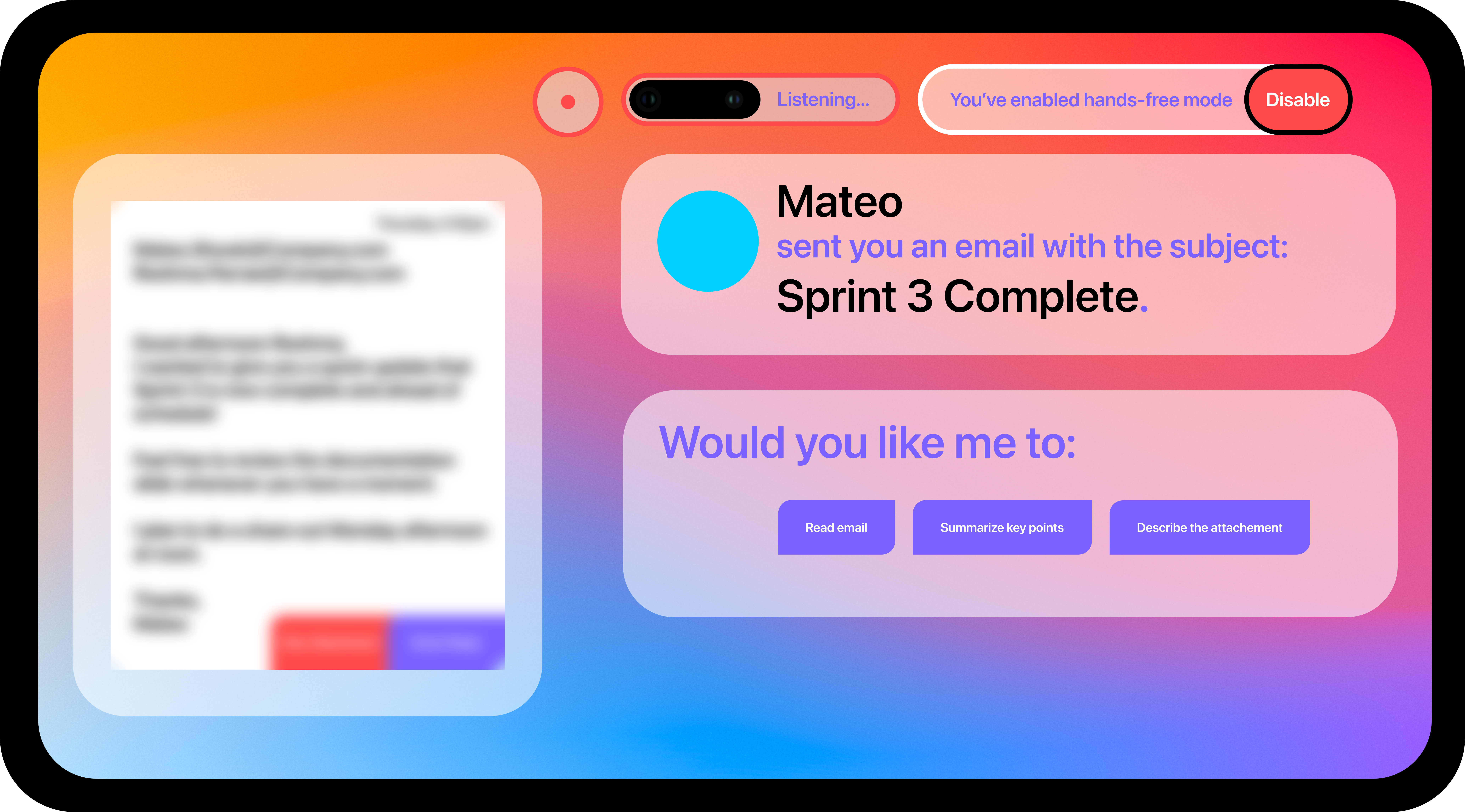
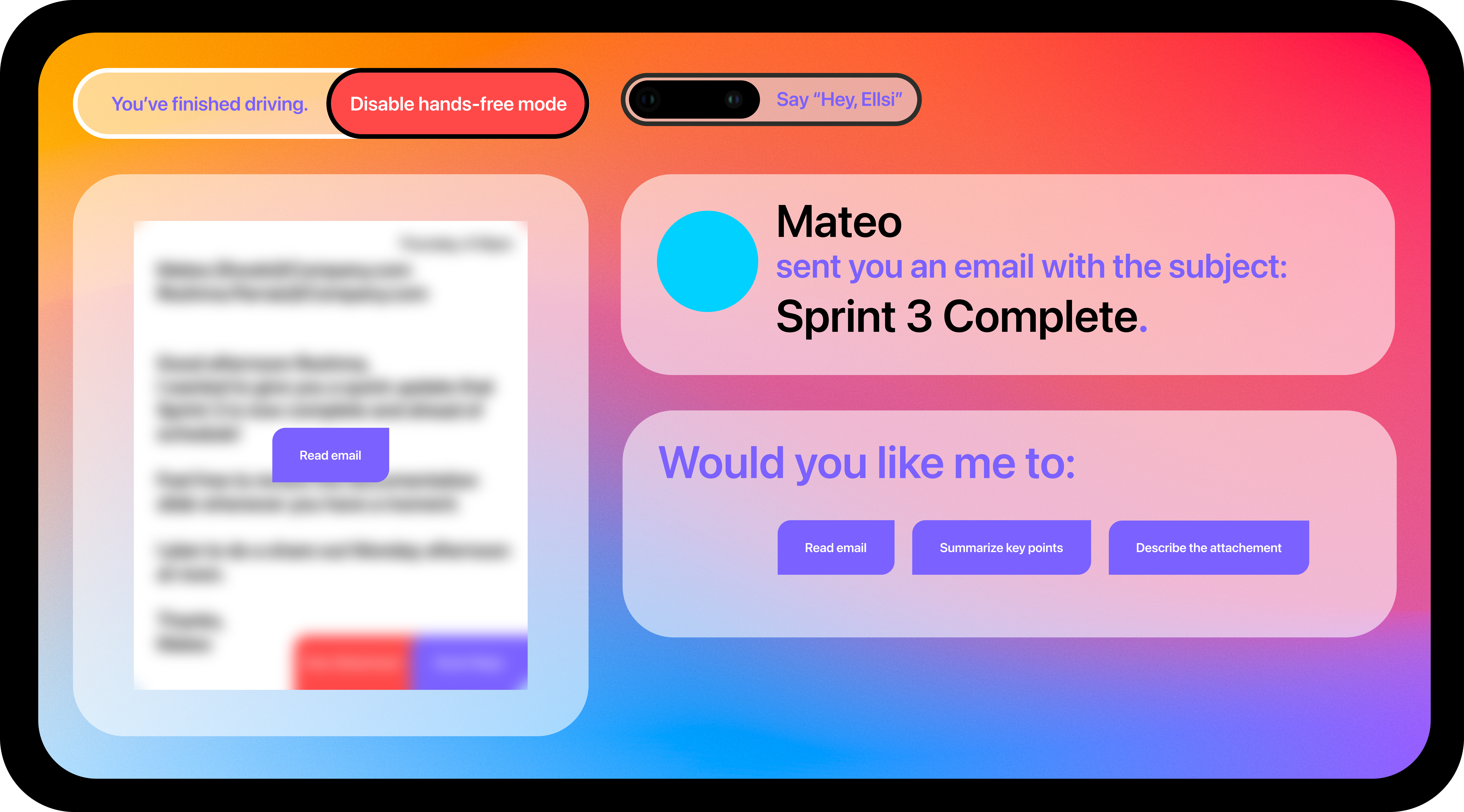
When the speech recognition and synthesis API came to webkit for web browsers about 10 years ago, due to my early prototyping voice interfaces at the time, I got to contribute to, the feedback and testing of, the implementation of the speech recognition API in Chromium—particularly in my tests of using a universal hotword that always listened for "X...Ellsi". Only listening for that variable hotword and only starting to fully process vocal input once the hotword was understood/consent given to highlight user privacy.
In implementing the call flows when programming the prototypes, in later 2016, I used a combination of speech and non-speech confirmations as well as random or seemingly random but deliberate responses to best convey natural speech from the very earliest designs. Variety adds "spice" to conversation—there seems to be a beauty in discovering in a conversation and not one that is expected and predictable. There is a critical line to be followed in assistance and deliverability of content with personality for a successful VUX.
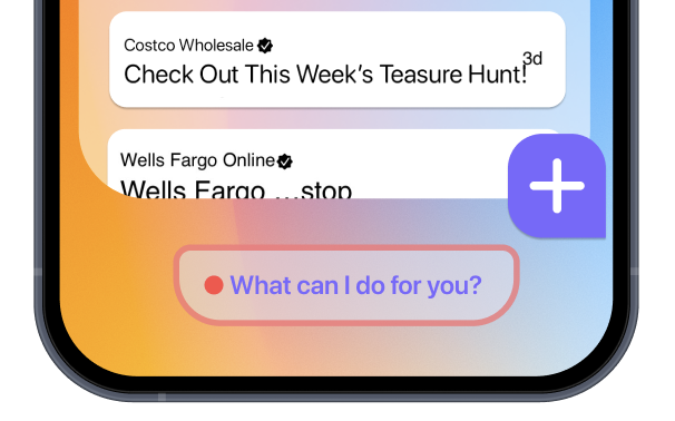
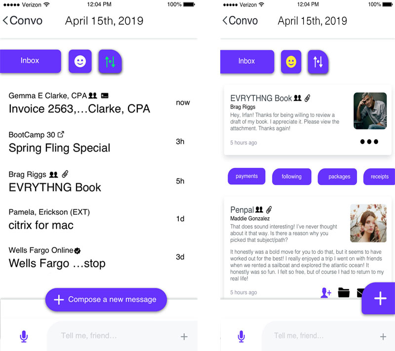
There are most likely going to be times when the user will need to take manual control of the interface, as per conversational design, when voice interfaces are more cumbersome or inappropriate; for example in emergencies or when humans do not typically have a similar conversation. As per this, Ellsi offers a hybrid interface to explore further detail when voice is the primary interaction to get to those interfaces in the flow. A sample of that visual UI is present in the following.
While some of the story of this process is visuals and research, Ellsi merges the best of conversational interaction design with the best of visual design and research—all of which are important. Conversations when full attention is not needed, steps are limited, and natural conversation solves similar tasks and a visual interface when more attention is required, there isn’t a natural conversation that can accomplish the task, and conversing the information required can't be done comfortably and openly.
A core element of Human-Computer Interaction that extends to Voice UI design is comfort and intuition in interaction. Conversations should have a flow, know when to respond and when to listen, and listen actively, and at the same time leverage the strengths of technology as a service for the user.
And leverage the partnership within conversation through H.P. Grice’s Maxims of conversation:
- The Maxium of Quality can be understood as having quality and honesty in one’s speech—genuine, straightforward, and helpful.
- The Maxim of Quantity can be understood as providing enough information to answer or prompt call-to-action, but not overwhelm.
- The Maxim of Relation as maximizing the relevancy of content and information answered with following the informativeness and quality of responses that serve and do not overwhelm.
- The Maxim of Manner—communicating clearly. None of the above serves its best if it is not delivered in a clear matter.
This and more is part of how Ellsi is designed to conduct itself in a natural, useful manner while striving to be contextual in voice and visual design to match humans to human need without reinventing the wheel. This interface may exist in unique visuals, but the core insights can be implemented in a design language compliant experience.
Speech recognition has come a long way and can often transcribe what the user says; but is not perfect however, what is critical is understanding what the user meant in addition to and an extension of what they say. The best way one can do this is through listening. While at Apple Retail, I learned about active listening. Listening to the conversation as a whole not just the words but the experience of the conversation. The brain learns or memorizes information through experiences and when one leverages this to help others in communication, as I aim to do too, one can also learn to leverage this in Voice UIs between technology and person.
As all parts of great Experience Design, it is important to understand and work for and with the people involved. Not the "users". They’re people. Both one’s team and recipient of the service. Communication is key to both in Voice UI design. We must understand who our users are; who one's team is and its members are, be compassionate to them in understanding their context and goals. An important part of the role of an Experience Designer is to be a storyteller. That includes knowing our audience; moving our audience. To understand the story of the user and how one’s product or service can augment their story. Through research, understanding what their needs are and how we can meet them—the journeys they take to do things in their life and how we can aide and cooperate positively to and in those journeys. Exactly what Ellsi was designed and aims to do.
What makes Ellsi different
Ellsi was ideated out of wanting to serve people, for their interaction with technology to become more People-First through understanding and assisting them in accomplishing their goals. Our user research was augmented by our philosophical research where we learned and discussed how people work towards their goals, their motivations and how the environment aides in acomplishing or diswaying them. In doing this and theorizing how technology could be applied to solve this problem, I learned about understanding intent and categorizing intent of the user leading down to the path of meaning. Subsequently, how meaning is part of our behavior and perhaps how meaning might be part of technology's behavior, as is in conscious organisms; thus, leading to our addressing of Searle's Chinese Room thought experiment (as well as well known refutations and responses).
From learning how to steer Ellsi through the emotions of the user; not through their manipulation, but towards its assistance towards the user's goals—and the accomplishing thereof—and reflecting them with empathy towards fulfilling this purpose.
Solution
In addition to a conversational interface, I built more direct interface controls to optimize completion of quick tasks or to prompt direct action in an unobtrusive, clear and concise, fashion as part of a multi-modal interface.



Growth
I advanced my Front-End development and rapid prototyping abilities. As part of the Ellsi hi-fidelity prototypes, I experimented with building my own screen reader than sought to tell a story while navigating a webpage by offering directions, instructions, and context to prompt the most ease of use with assistive technology. All of this gave me an avenue to channel my love and ability for Intelligent and Voice interfaces.
Impact
The application of nearly all of my skillset on my own and directing them towards solving a problem we discovered through research.