Insights
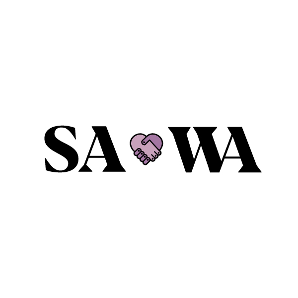
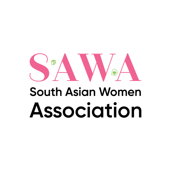
In my design for a brand identity for SAWA, the South Asian Women’s Association, I researched the organization, their efforts and derived the key causes of culture, communication, and collaboration. After this, I went to design colors representative of the themes of welcoming, growth, and teamwork; and then, compassion, empathy, and cause. These efforts resulted in a pink to represent compassion and love; but, unlike red, not passion, lust, and hunger. In addition, it was complimented by a lighter shade of green to represent growth, welcoming, the flow of communication, and the progress of collaboration, culture, and community—embracing tradition and welcoming the future.
Drafts
Feedback
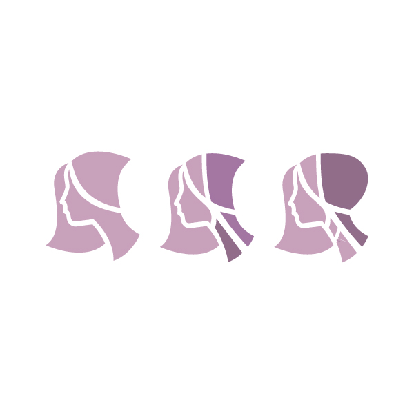
After I presented some early drafts of word- and brand-mark combinations, SAWA responded seeking something similar to stacking calligraphy, but in English, and they chose to go with the pink tone alone and wanted me to explore different shades of that and to maintain their brand of a woman in a headscarf, typical to the culture, but clean and modern in design.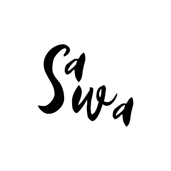

Final branding