Ellsi
Let's create a way to present notifications and content with empathy in a world where they are becoming more and more toxic.
Timeline
- Conducted User Research (contextual inquiries and interviews) in the psychological effect of notifications with fellow students I recruited
- Researched goals, emotions, and consciousness, individually, and how to apply that to technology under academic faculty from a Philosophy of the mind perspective
- Developed hi-fidelity prototypes, individually, with Front-End technologies
- Conducted conversational, interaction, visual, and UX Design refresh for iOS
Prompt
Distill problems discovered in Artificial Intelligence and notifications through User Research and Philosophical Research into a design and prototype of a People-First way to read, manage, and interact with notifications.
Strategy
Recruit and manage a team to conduct User Research identify problems, if any, and apply classical research and the iterative UX methodologies towards solving them
Challenges
- Being transparent and receiving consent and navigating the process of researching with health metrics in a safe manner
- Searle's Chinese Room thought experiment
- Beginning/restarting from scratch
Response
- Managing personal accounts, answers, stories, and details discovered in contextual inquiries anonymously
- Refuting John Searle's classical though experiment in a new way through studying common refutations and their responses
- Understanding that sometimes projects don't launch and when there is an improvement in technical ability or resources, starting from scratch can be required
Solution
User Research
After conducting surveys with a diverse group of students exploring how they used technology, with their consent, I accompanied them in certain situations observing their interactions with notifications on their phones and computers all aiming to learn how notifications, and technology in general, manipulates users.
We (a team I had recruited) interviewed students, the campus counseling and psychiatric services, and off-campus services further seeking to learn more about technology and notifications' impact on millennials’ mental health. In addition, we interviewed older "Gen Z" (late middle-school, high-school) individuals with their own and their parents’ consent to explore those that grew up in an age surrounded by the internet and technology. We learned, with anonymity, about the effect notifications have on human wellbeing including anxiety developed through anticipation of notifications over time to instances of ringtone hallucinations; for example, phantom vibrations. However while the impact of technology and notifications remained diverse as the groups we were exploring this impact with, an emerging sentiment was revealed where notifications and technology resembled stress, work, and labor whereas the desired or expected sentiment from technology was relief and entertainment.
To conclude our research, although what determined to be an equally important phase, we conducted contextual inquiries with our participants on breaks at their place of work, when they used their phones and had an opportunity to read received notifications (they were and were not anticipating), as well as in other locations in their life when given permission. When given consent, we measured their heart rate during these inquiries to determine a physiological effect when anticipating or receiving notifications.
We reached the conclusion that much of technology including that which may be built with user experience and empathy in mind, or so appears to be, actually has a pervasive, intrusive, addictive effect on the user in their everyday life. And while that gains more users or a cult following, it is detrimental to the wellbeing of the humans the technology should serve or at least be useful for in their lives.
Classical Research
While conducting the user studies summarized under User Research, I independently and individually conducted research in Artificial Intelligence from a philosophical and cognitive psychological perspective under supervision and later review of experts in the field. In doing so, reflecting on my readings and times studying consciousness from theistic, atheistic, and non-theistic perspectives, I wrote three papers (introduced in the page on my papers and presentations). My aim in doing so was to create a strategy reflecting on consciousness’ evolution and from that create a methodology and techniques for technology to be a more Human-Centered and empathetic experience unlike that which was shown in the User Research. To promote and benefit the user and gain a genuine, non-cult following. I did this by exploring behavior, goal creation, and drive towards goal achievement and reflected on the pathways manipulated in the user—perhaps even a weaponizing of natural drives. Whereas my aim was empathy and compassion from the technology itself, I then sought to explore levels of consciousness and their evolution from sentience onwards across species and through evolution. Through both of these, I developed a system and formula to afford a natural drive in technology, to be more empathetic, through accomplishing its goals of serving the user.
Prototyping
After concluding these two phases of research, I began prototyping formulas of my research in software as well as interface concepts and experience elements for an assistant. I believed other than a set of techniques by which to build more Human-Centered technology, which was also developed, a system to check notifications in a more relevant, contextual manner, to the users' wants and ambitions not manipulating instinctive drives, was needed, as per the research. Between 2013 and 2016 there were no phases of iterative prototyping, design, and testing as I was restrained by intellectual property and no-compete agreements. However, when I was intellectually free and legally able, I built a hi-fidelity prototype featuring more interactions and a complete experience designed to serve relevant notifications with empathy so as to empower and promote the user, the human, in their life.
A key element of these prototypes were a formula and implementation of artificial emotions to recreate drive and purpose for the user and their goals as explored in my papers. For some more on this and how the papers relate to Ellsi, I ask you to visit Ellsi's introductory homepage.
I am able to demonstrate live instances and recordings of these prototypes in action. I can not however make it live for unlimited, readily use due to API limits and other costs that I can not maintain on my own, I hope you can understand.
Voice UI Design
When I decided from my research that I wanted to build an Artificially Intelligent way to manage notifications in a more People-First manner, I began designing an assistant. In the conversational design process, I wireframed different layouts, callflows*, and brand elements. I believe brand elements were something to take seriously as the proper indicators, colors, and sounds are critical to the user’s participation and interaction with the Voice UI. Indicators, such as the proper listening sounds that I worked on, are important because they set up the user’s expectations and when that expectation is properly met with empathy and correspondence from the VUI, one has built an enriching voice experience. These same brand elements, and others, were critical in affording accessible and usable error states in case interaction was hindered or not recognized in some way.
While speech recognition has become more more advanced with deep learning that does not entail speech comprehension has as well.
And, lastly, I spent such effort on branding, initially; including for example onomastic research with names, is because “There is no such thing as a voice user interface with no personality.” -Cohen, Giangola, and Balough. While in some regard it is inappropriate to anthropomorphize AI, it is almost necessary in VUI, to a certain degree, as we talk best with those we perceive as our peers. We’re perhaps overly formal with superiors; e.g. a boss, or overly informal with others; for example, a pet or a baby. The prototypes went through major design changes; however, the redesign that is included in this story is, also, meant to communicate and express the brand and friendliness we hope to come across with Ellsi—essential in expressing the message of your VUI (Ellsi being empathy).
It seems it is natural, based on our own bias/experiences, we make assumptions from hearing a voice. As a designer, I've worked a lot with the psychology and, subliminal and overt, meanings behind colors, text, brands, and other experiential elements. However in designing a VUI, a strategy I've learned with Ellsi is that the voice experience—the tone, how it speaks to the person, how it serves the person, and how it affords their interaction and allows their goal completion is critical. It is important to consistently and critically remind ourselves to design an empathetic experience to help serve the user and eliminate any assumptions one might have of the voice with the helpfulness of the voice.
*In the (following) callflow process, I processed different dialogs and how they would flow through Ellsi. These are best observed in a demo of a hi-fidelity prototype of Ellsi that I am happy to present. Find a preview just before the Details heading
Dialog Callflows
Notice the focus on contextuality with the ecosystem and the user along with emphasis on privacy and the use of cards as well as a conversational interface when conversation is more intuitive or appropriate or the visual interface when otherwise.
User: “Ellsi, add turmeric, cardamom, and chili powder to my shopping list.”
Ellsi: “I’ve added those three for you.”
[Displays shopping list with three newest items on top]
Ellsi: “Would you like me to remind you when you’re at a particular store?”
User: “Yes, that would be so helpful!”
Ellsi: “Which store? Or search for it in the following card:”
[Displays map card]
Response option A.) *User speaks location*
Ellsi: “I’m setting the location reminder.”
Ellsi: If closer location, “I happened to find a closer location to you, would you like to see where that is?”
User: “No, thank you. I’m heading to that part of town.”
Ellsi: “Sounds good!”
Response option B.) *User searches location*
[Displays list of closest matching results]
[User selects location]
Ellsi: “I just set the reminder.”
User: “Set a reminder for Tasneem’s exam on Wednesday to send her the motivational message in Notes.”
“Ellsi: please select which note you’d like me to remind you with.”
[Displays Notes card]
[User selects note]
Ellsi: “Alright, I’ll remind you.”
User: “What did Mariana email me?”
[User is driving, Ellsi will read it]
Ellsi: “Mariana said "I just finished the project and want to know what you think!" There is an attachment.”
User: “Thank you Ellsi!”
Ellsi: “You’re welcome!”
User: “What’s the weather near Kelcie?”
Ellsi:"I found a previously shared location in California."
Ellsi: “The weather there is chilly for this time of year, but it is expected to warm up later this week. I’m displaying the forecast:”
[Displays forecast card]
User: “Message her: "I heard it is chilly there—stay warm!"”
Ellsi: “Message sent!”
In enacting the callflows when programming the prototypes, in later 2016, I used a combination of speech and non-speech confirmations as well as random or seemingly random but deliberate responses to best convey natural speech from the very earliest designs. Variety adds "spice" to conversation—there seems to be a beauty in discovering in a conversation and not one that is expected and predictable. There is a critical line to be followed in assistance and deliverability of content with personality for a successful VUX.
There are most likely going to be times when the user will need to take manual control of the interface, as per conversational design, when voice interfaces are more cumbersome or inappropriate; for example in emergencies or when humans do not typically have a similar conversation. As per this, Ellsi offers a hybrid interface to explore further detail when voice is the primary interaction to get to those interfaces in the flow. A sample of that visual UI is present in the following.
While some of the story of this process is visuals and research, Ellsi merges the best of conversational interaction design with the best of visual design and research—all of which are important. Conversations when full attention is not needed, steps are limited, and natural conversation solves similar tasks and a visual interface when more attention is required, there isn’t a natural conversation that can accomplish the task, and conversing the information required can't be done comfortably and openly.
A core element of Human-Computer Interaction that extends to Voice UI design is comfort and intuition in interaction. Conversations should have a flow, know when to respond and when to listen, and listen actively, and at the same time leverage the strengths of technology as a service for the user.
And leverage the partnership within conversation through H.P. Grice’s Maxims of conversation:
- Having quality and honesty in one’s speech—genuine, straightforward, and helpful.
- Providing enough information to answer or prompt call-to-action, but not overwhelm.
- Maximizing the relevancy of content and information answered with following the informativeness and quality of responses that serve and do not overwhelm.
- Communicate clearly. None of the above serves its best if it is not delivered in a clear matter.
This and more is part of how Ellsi is designed to conduct itself in a natural, useful manner while striving to be contextual in voice and visual design.
Speech recognition has come a long way and can often transcribe what the user says; but is not perfect however, what is critical is understanding what the user meant in addition to and an extension of what they say. The best way one can do this is through listening. While at Apple Retail, I learned about active listening. Listening to the conversation as a whole not just the words but the experience of the conversation. The brain learns or memorizes information through experiences and when one leverages this to help others in communication, as I aim to do too, one can also learn to leverage this in Voice UIs between technology and person.
As all parts of great Experience Design, it is important to understand and work for and with the people involved. Not the "users". They’re people. Both one’s team and recipient of the service. Communication is key to both in Voice UI design. We must understand who our users are; who one's team is and its members are, be compassionate to them in understanding their context and goals. An important part of the role of an Experience Designer is to be a storyteller. That includes knowing our audience; moving our audience. To understand the story of the user and how one’s product or service can augment their story. Through research, understanding what their needs are and how we can meet them—the journeys they take to do things in their life and how we can aide and cooperate positively to and in those journeys. Exactly what Ellsi was designed and aims to do.
What makes Ellsi different
Ellsi was ideated out of wanting to serve people, for their interaction with technology to become more People-First through understanding and assisting them in accomplishing their goals. Our user research was augmented by our philosophical research where we learned and discussed how people work towards their goals, their motivations and how the environment aides in acomplishing or diswaying them. In doing this and theorizing how technology could be applied to solve this problem, I learned about understanding intent and categorizing intent of the user leading down to the path of meaning. Subsequently, how meaning is part of our behavior and perhaps how meaning might be part of technology's behavior, as is in conscious organisms; thus, leading to our addressing of Searle's Chinese Room thought experiment (as well as well known refutations and responses).
From learning how to steer Ellsi through the emotions of the user; not through their manipulation, but towards its assistance towards the user's goals—and the accomplishing thereof—and reflecting them with empathy towards fulfilling this purpose.
Visual and Interaction Design
Now in the process of a true visual design, we researched further to construct Human-Centered interface elements:
A feature I designed through user and scientific research studies is the placement of the call-to-action button. While most humans are right handed, one can assume through efficiency to place a call-to-action button in the lower right would be optimal; however, this isn't inclusive. While the lowest area of a screen is most reachable, the thumb is at its resting point when extended and not flexed at the joint, its natural position, meaning the call-to-action in the bottom right would not be the optimal place for a right-handed individual, but perhaps a button on the left. For a more inclusive design, we use an elongated ellipse call-to-action button reachable by both thumbs when relaxed, which is; the button, retractable to follow the thumb, in the lower area of their choice as visible in the designs below.
In addition to a conversational interface, I built more direct interface controls to optimize completion of quick tasks or to prompt direct action in an unobtrusive, clear and concise, fashion.
This is first done in the moment view where we summarize what, through the user’s indication and our research, is most relevant to the user at this moment and reveal three prompts to promote use.
The main form of user interaction is the conversational interface where we use natural language understanding and standards for conversational design, cards, and visual design to best deliver information and prompt action across the app and the device.
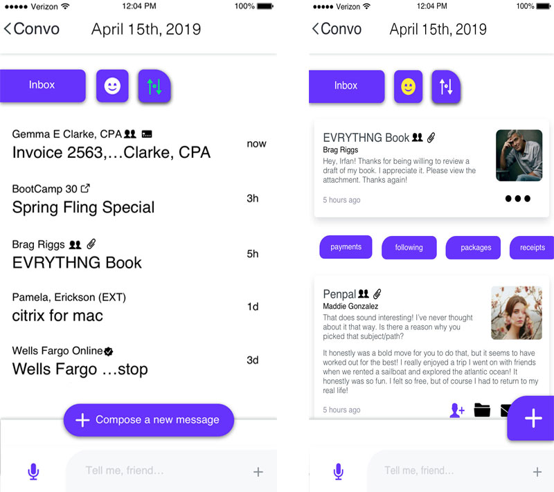
From conversation mode, one can view their relevant notifications within the app, for example, email, showed by two different methods in these two views. I’ve also used chips to easily find emails of certain types; for example, payments or packages. Using badges, we allow for ease of recognition through verification from official domains and sources to hinder phishing attempts and indicate which conversations one is following, grouping flagging and favorites.
Another view is one to display the weather as shown here in the Today’s weather view reachable from expansion of the introductory weather card in the conversational interface. In this view, the user has more control as per the ability to shift through the day, confirm or deny weather preference, or do more with the app based on this information.
In this forecast view, we designed a different way of visually delivering the weekly weather. In what our research, including usability tests, were able to observe what was most quickly interpretable and recognizable. The process of reading numbers involves sight and recognition and then pairing that recognition with intelligence. While this happens quickly mentally, there seems to be less of a cognitive load in recognizing colors and distance that does not require math and relies on visually recognizable information/memories. Similar to seeing and recognizing something is hot v.s. seeing, reading, understanding numbers and their meaning/correlation to weather. Therefore, we used shades of warmer colors to represent heat and cooler colors to represent the opposite as well as fluctuations in length to represent temperature and precipitation.
Solution


Growth
I advanced my Front-End development and rapid prototyping abilities. As part of the Ellsi hi-fidelity prototypes; which I can demonstrate privately, I experimented with building my own screen reader than sought to tell a story while navigating a webpage by offering directions, instructions, and context to prompt the most ease of use with assistive technology.
Impact
The application of nearly all of my skillset on my own and directing them towards solving a problem we discovered through research.