South Asian Women Association
Let's create a modern brand for a female-led organization seeking to reach out to women to connect them to resources in the community
Timeline
- Research the organization and their mission through interviews
- Determine key elements towards SAWA's approach of this mission
- Develop colors and visuals corresponding to that culture
Insight
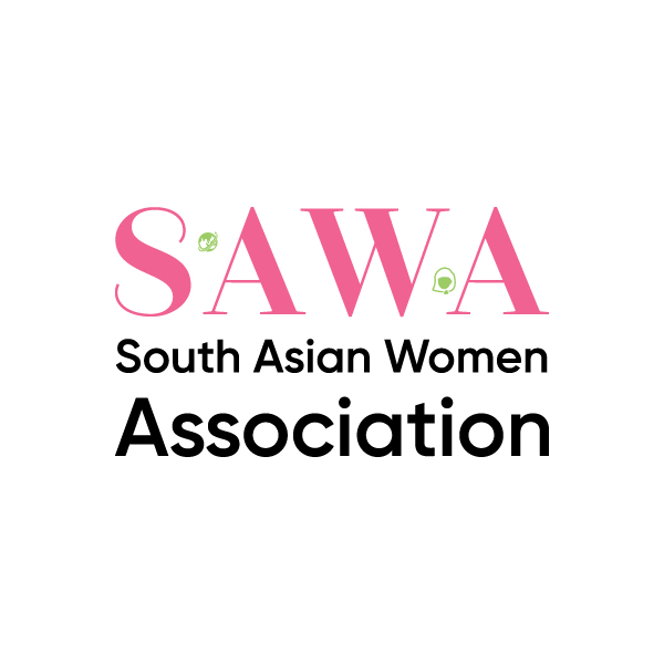
In my design for a brand identity for SAWA, the South Asian Women’s Association, I researched the organization, their efforts and derived the key causes of culture, communication, and collaboration. After this, I went to design colors representative of the themes of welcoming, growth, and teamwork; and then, compassion, empathy, and cause. These efforts resulted in a pink to represent compassion and love; but, unlike red, not passion, lust, and hunger. In addition, it was complimented by a lighter shade of green to represent growth, welcoming, the flow of communication, and the progress of collaboration, culture, and community—embracing tradition and welcoming the future.
Feedback
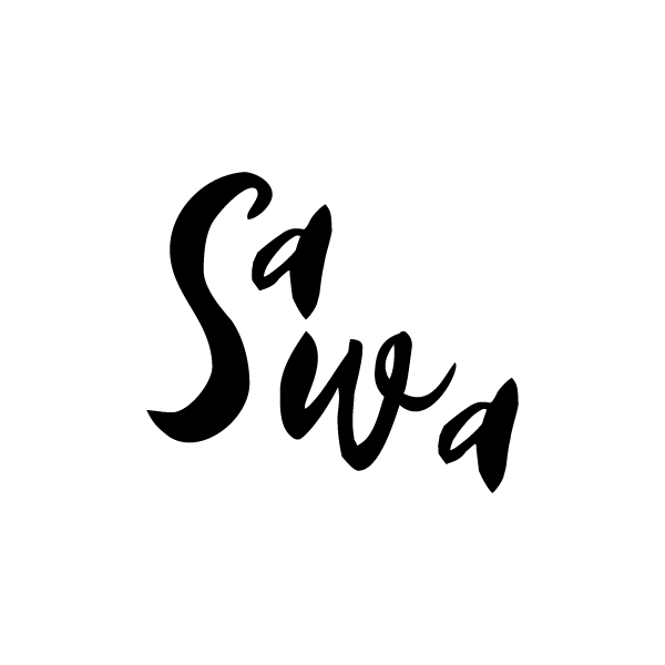
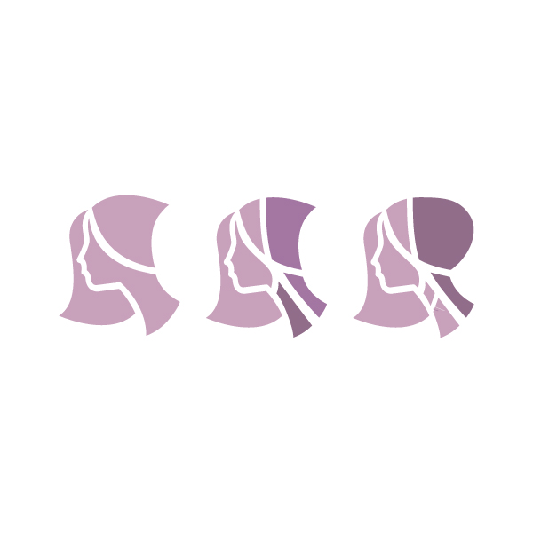
After I presented some early drafts of word- and brand-mark combinations, SAWA responded seeking something similar to stacking calligraphy, but in English, and they chose to go with the pink tone alone and wanted me to explore different shades of that and to maintain their brand of a woman in a headscarf, typical to the culture, but clean and modern in design.
Response
Worked towards designing a final brandmark emphasizing the letter "S" along with a headscarf and more relaxed/earthy romantic tones

Solution
Growth
All design is iterative in its best form. It best begins with research and grows through feedback. I learned this from a visual perspective in one of my first consultations on my own.
Impact
I was able to show those in the community that I could apply my understandings of psychology, my pattern of taste, and talent at creativity towards providing a service for myself and others.