

Hello! Welcome to My Portfolio.
I create empathetic, accessible, and interactive experiences inspired by human connection and technology.

AI & Voice UX
Challenge
In an age where notifications increasingly manipulate attention, contribute to anxiety, and disrupt focus, how might we design a voice-driven system that respects the user’s emotional state, supports goal achievement, and delivers content with empathy—rather than addiction?
Solution
I led the research, design, and prototyping of Ellsi, an emotionally intelligent voice assistant designed to reframe how we engage with notifications—through ethics, empathy, and multi-modal interaction.
- Cross-Disciplinary User Research: Led 50+ contextual inquiries and interviews, tracking physiological and emotional responses.
- Philosophy-Backed Cognitive Strategy: Researched and published frameworks to evolve technology around genuine empathy.
- Voice & Visual Prototyping: Delivered two high-fidelity prototypes after 100+ iterations integrating speech recognition and emotional simulation.
- Voice Persona & Brand System: Developed 13 audio cues and dialog flows anchored in empathy and clarity.
- Hybrid UI: Engineered a visual interface for non-verbal control and error recovery in varied attention contexts.
Design Philosophy
Ellsi is not just a voice assistant—it’s a counter-narrative to exploitative digital norms.
- Empathy as Core Function: Every notification is reframed as a contextual offer aligned with user goals.
- Human-Centered, not User-Centered: The assistant listens with intent and responds with meaning.
- Emotional Intelligence over Behavioral Hacking: Designed based on evolutionary theories of sentience and drive.
- Voice as Relationship, Not Interface: Crafted a consistent, calming, and supportive persona.
- Systems-Level Ethical Design: Proposed a future of AI that is compassionate and truly innovative.
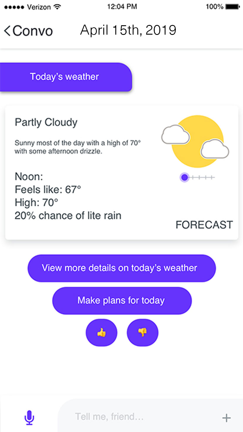
Conversational Flow Design & Analysis
Blended Intelligence: Expanding Voice through Hybrid Interaction
User: “Ellsi, add turmeric, cardamom, and chili powder to my shopping list.”
Ellsi: “I’ve added those three for you.”
[Displays shopping list with three newest items on top]
Ellsi: “Would you like me to remind you when you’re at a particular store?”
User: “Yes, that would be so helpful!”
Ellsi: “Which store? Or search for it in the following card:”
[Displays map card]
Path A – Voice Response
User: “Fresh Thyme on Grandview Ave.”
Ellsi: “I’m setting the location reminder.”
Ellsi: “I found a closer location you’ve visited before. Would you like directions and a reminder there instead?”
User: “No, thank you. I’m heading to that part of town.”
Ellsi: “Sounds good!”
Path B – Visual Selection
[Displays list of closest matching results]
[User selects location]
Ellsi: “I just set the reminder.”
This moment introduces a multi-modal system with hands-free, eyes-free support, extending beyond traditional voice UX. By blending visual and conversational interaction, Ellsi becomes more adaptive, meeting people in both comfort and uncertainty—empowering them to act without friction.
Because the user is signed in, Ellsi gathers input flexibly, completing tasks in context using Natural Language Understanding and past interactions. Rather than forcing structure, Ellsi fills in the blanks—bridging brand, product, and behavior across devices.
Contextual Intelligence: Meeting Users Where They Are
User: “Set a reminder for Karmen’s exam on Wednesday to send her the motivational message I wrote last week for my friends.”
Ellsi: “Please select which note you’d like me to remind you with.”
[Displays Notes card]
[User selects note]
Ellsi: “Alright, I’ll remind you.”
Here, Ellsi shows its adaptive capability by recognizing the user’s past behavior—accessing saved notes and sending them to frequent contacts. This seamless action reflects the strength of context-aware design in Voice UX.
By aligning with the user’s mental model in real time, Ellsi supports fluid interaction, solving spontaneous needs and reinforcing trust. Context isn’t just convenience—it’s the core of designing truly intelligent, responsive systems.
Designing for the Margins of Attention
Ellsi isn’t just a voice assistant—it’s a companion in movement, a translator of moments. These final flows show how voice and ambient intelligence meet real life: when screens are out of reach, but people still need to think, feel, and act.
Large text and focused actions help users stay on task while hands-free. The always-listening interface is easy to use—and just as easy to dismiss—for safe, seamless interaction on the go.
When driving ends, Ellsi shifts modes—stopping voice input and prompting a return to touch. A flexible layout adapts control placement based on vehicle side, offering quick access to resume or exit. Users can speak a hotword or tap to preview messages and re-engage the full hybrid interface.
Tone Matching: Personality That Listens Before It Speaks
User: “What did Mateo email me?”
[User is driving, Ellsi reads it aloud instead of showing a preview card]
Ellsi: “Mateo said, ‘Sprint 3 completed on time and we're on track to target! I'd like to know what you think before I share with any others.’ There is an attachment.”
User: “Thank you Ellsi!”
Ellsi: “You’re welcome! That sounds like good news. I’ll add a snapshot to your moments view the next time you're on your device.”
[Ellsi updates the moments view with a visual summary of the email and attachment]
These flows show Ellsi adjusting her tone—sometimes warm and conversational, other times clear and directive—based on the user’s approach. In Voice UX, personality isn’t static; it’s strategic.
Adaptation depends on:
- The interface’s role—assistant vs. automation
- The brand’s voice and experience goals
- The user’s tone and communication norms
Great voice design meets the user where they are, not just in context, but in character.
Resilience by Design: Repairing with Context and Care
User: “Start a 10 minute timer called check live...”
[Ellsi waits briefly, detecting pause]
[Plays error chime]
Ellsi: “I don't think you completed your last question.”
User: “Oh sorry, I was distracted! Set the timer for ‘check the live blog.’”
Ellsi: “10 minutes and counting!”
Ellsi handles confusion with graceful recovery, using on-device memory to respect privacy while learning from past interactions. When a query is incomplete:
- First, she reprompts quickly, nudging gently in the moment
- On repeat, reframing with detail, clarifying exactly what’s missing
By staying aware of nearby context and typical patterns, Ellsi keeps the experience flowing—empathetic, efficient, and distraction-tolerant.
Login-Optimized, Not Login-Limited
User: “What’s the weather like near Kiko?”
Ellsi: “I found a previously shared current location in Maine.”
Ellsi: “The weather there is chilly for this time of year, but it's expected to warm up later this week. I’m displaying the forecast:”
[Displays forecast card]
User: “Message her: ‘I heard it’s cold there! But not too cool to be cool. You got this—stay warm!’”
Ellsi: “Message sent!”
Ellsi uses customer login to pre-fill essential details—like contact names—reducing friction if an error occurs. While she functions without login, the experience is smarter and smoother when signed in.
Across these flows, Ellsi handles variable user responseswith Natural Language Understanding, filling in blanks via statistical grammar that mirrors natural human conversation—flexible, familiar, and fluid.
Deliverables
6 Steps to Exceptional Voice Interface Design
| Step | Preview | What | How |
|---|---|---|---|
| 1. Requirements Definition | A VUI bridges user comfort and business priorities through innovation. | Define the business motivation and align with user and application goals. |
|
| 2. High-Level Design | Set the stage for seamless interaction with a brand’s voice. | Establish dialog strategy, grammar type, and persona alignment. |
|
| 3. Detailed Design | Focus on research-backed scenarios to ensure user satisfaction. | Craft precise dialogs and tailored prompts for all use cases. |
|
| 4. Development | Blueprint to reality with to have detail where it matters, flexibility where it counts. | Integrate coding practices with front-end and back-end systems. | Build iteratively with stakeholders under a shared vision.
|
| 5. Testing | Thorough testing ensures system reliability and trust. | Design the system to work reliably at scale, for everyone intended in real-world scenarios. |
|
| 6. Tuning | Continuously evolve the VUI with the user in mind. | Optimize grammar, accuracy, and all-around satisfaction through feedback. | Identify high-traffic patterns to inform strategy
|
Deliverables
Interface and Interaction Highlights
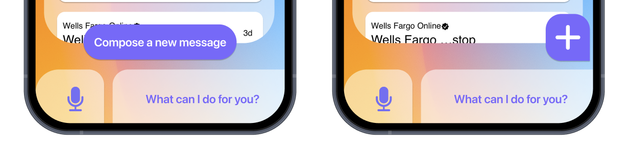
Standard UI places CTAs in the bottom right, assuming right-handed efficiency. But our research revealed that this position strains the thumb’s natural arc. I designed a flexible, elliptical button that adapts to each user’s relaxed reach—left or right—making interaction feel intuitive, inclusive, and effortless.
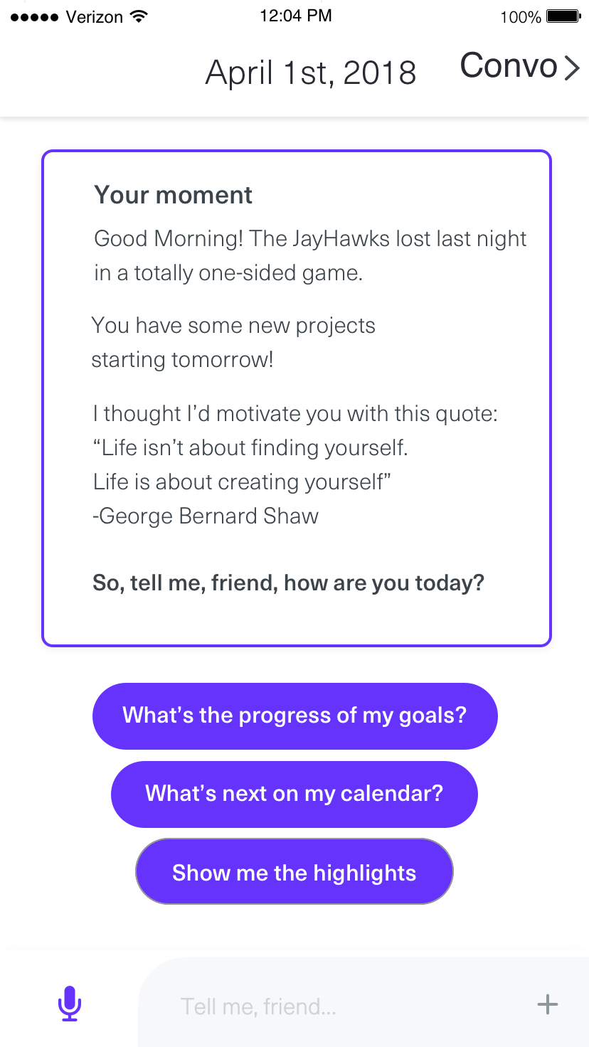
The experience opens with a personalized “Moment” view—surface-level calm, deeply intentional. Based on user cues and contextual research, it highlights what matters most right now, offering three gentle prompts to encourage meaningful engagement.
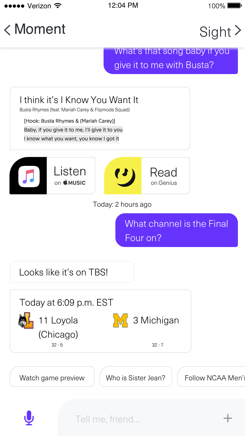
At the core of the multimodal experience is conversation. We pair natural language understanding with best practices in conversational UX, card systems, and visual design—creating a seamless flow of dialogue, context, and action across both app and device.
In mobile-first contexts, we previewed a voice-only interface with a universal hotword—designed for instant engagement without typing. The dialog flows illustrate how users can navigate key moments entirely hands-free.
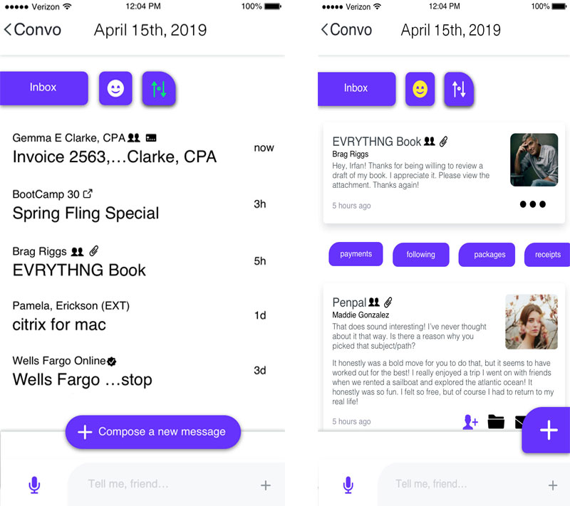
From conversation mode, users can access email and other alerts through two distinct views. Smart chips filter by type—like payments or packages—while badges verify sources, flag priorities, and surface followed threads, reinforcing trust and clarity at a glance.
Expanding the introductory weather card opens the Today view, where users can scroll through the day, confirm or adjust preferences, and take action—all from a conversational, context-aware interface.

Accessibility
Accessibility in High-Traffic Public Systems
Challenge
How do you build a high-traffic website for a regional airport that’s fast, on-brand, and fully inclusive—while overcoming skepticism about accessibility’s perceived complexity, cost, and impact on visual design?
Solution
I led the full accessibility strategy, UX design, and front-end development for the Bishop International Airport website, ensuring an equitable, efficient experience for all travelers.
- End-to-End Accessibility Ownership: Directed accessibility-first development from ideation to launch—ensuring WCAG 2.1 compliance across visual, navigational, and interactive elements.
- Intuitive, Keyboard-Friendly Navigation: Designed fully compliant menus using ARIA roles and keyboard/tab structures for travelers with assistive needs.
Accessible Navigation
A fully keyboard and screen reader-friendly navigation system was built from the ground up, tested live with assistive technologies.Screen Reader & Keyboard Navigation Test
A screen-recorded demo of the Bishop International Airport website in action—showcasing complex navigation made fully accessible. From arrow keys to ARIA descriptions, each element was structured to be operable, perceivable, and efficient for users navigating by assistive technology. - Cross-Functional Advocacy: Facilitated stakeholder buy-in through workshops, live demos, and strategy presentations that reframed accessibility as a business and human benefit.
- Scalable, Performance-Oriented Design: Optimized for high traffic loads during peak travel, while maintaining high accessibility and cross-device consistency.
- Conference Thought Leadership: Co-presented accessibility strategy at three regional design and tech conferences, helping shift industry norms toward inclusive development.
Design Philosophy
Accessibility isn’t a checkbox—it’s an invitation.
- Lead with Empathy, Not Litigation: I overcame internal hesitation by reframing accessibility as a mutual value—where business goals align with human rights. Rather than leveraging fear of legal action, I inspired teams to see inclusion as a form of design excellence.
- Accessibility as Systems Thinking: I designed the site to be operable, perceivable, and robust at every layer—from visual design to code structure—without creating silos between design and development.
- Culture Through Craft: I didn’t just implement accessibility; I cultivated it. My work at Bishop transformed team culture—integrating accessibility into roadmaps, sprints, QA, and documentation, ensuring sustained impact beyond a single launch.
Creating an Inclusive Culture in Higher Education
Challenge
At a university with deeply entrenched legacy systems and resource constraints, how can accessibility become a shared practice—not just a checklist before launch—especially in emotionally and socially urgent spaces like Title IX?
Solution
As part of the Digital Content and Accessibility Team, I helped lead a cultural and systemic shift in how the university approaches inclusion, accessibility, and digital equity.
- WCAG Reporting System Design: Built a Likert-scale based evaluation framework prioritizing barriers by harm to users vs. effort to fix—accelerating remediation and creating an objective, human-centered roadmap for accessibility.
- Universal Design Advocacy: Ensured every tool (internal or procured) met high accessibility and usability standards. This helped influence key experiences including Admissions, Title IX, and the Scholarships portal.
- High-Impact Accessible Redesigns: Designed and prototyped interface solutions for central university platforms, ensuring screen reader support, correct heading structures (e.g. site name as H2, page name as H1), and inclusive layout decisions.
- From Digital Equity to Real-World Justice: Worked on the Title IX website redesign that directly enabled over 100 survivors of Larry Nassar’s abuse to begin filing claims—showing the tangible power of accessibility in the pursuit of justice.
- Cross-Industry Impact: My work at MSU led to accessibility evaluation work for Fortune 500 clients and helped launch inclusive design strategy at a regional UX consultancy.
Design Philosophy
Accessibility isn’t about perfection. It’s about progress you can feel.
- Design for Justice, Not Just Compliance: I approach accessibility as a vehicle for systemic equity—whether opening scholarship access, clarifying admissions workflows, or supporting survivors seeking justice.
- Small Changes, Big Impacts: A single heading structure change (H1 for the page, H2 for the site title) can completely transform a screen reader user’s experience. My work focuses on subtle interventions that have exponential human value.
- Build the Culture While Building the Product: Change doesn’t happen in documentation—it happens in trust. I gained buy-in from resistant stakeholders by mapping accessibility goals to shared human values, and creating approachable systems that met teams where they were.
Deliverables
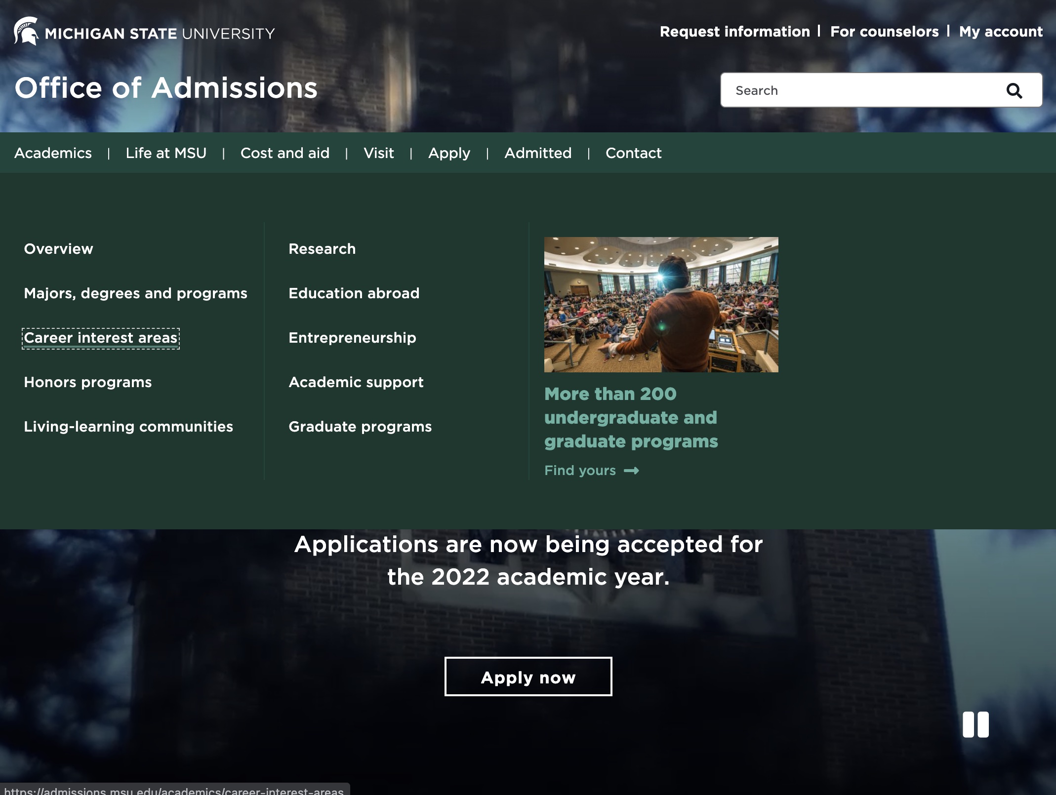
A screenshot of the redesigned MSU Admissions homepage, featuring accessible navigation, clear heading structure, and tested usability—inviting all users to explore higher education equally.
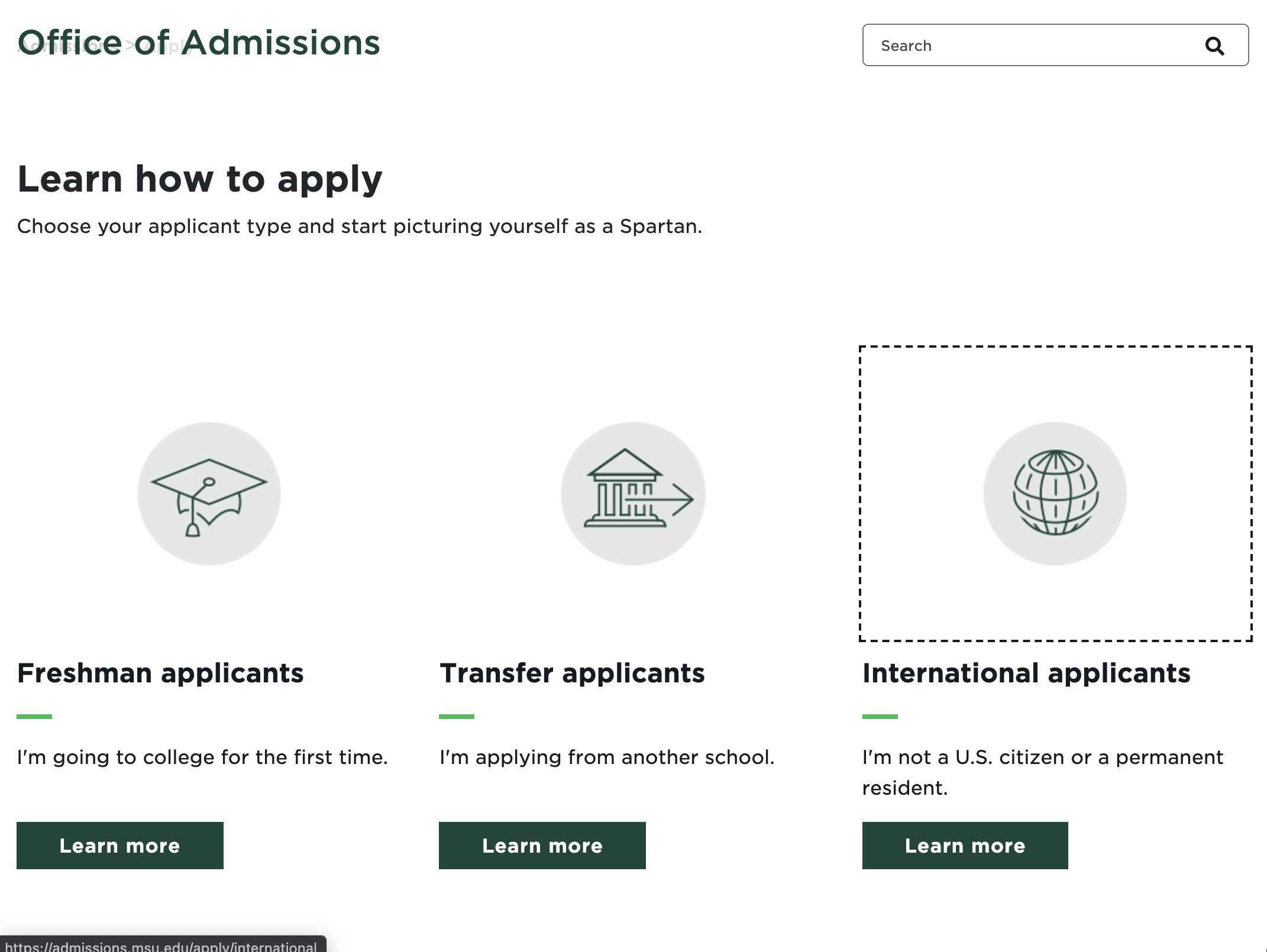
This screenshot demonstrates proper focus indicators and visible tab order—a critical aspect of usability for screen reader and keyboard-only users.
A glimpse of the redesigned MSU Title IX page. Our decision to structure the site title as an H2 and the page title as an H1 improved screen reader navigation—becoming a quiet, foundational detail in a system that enabled over 100 survivors to begin their pursuit of justice.
Stakeholder Engagement
Challenge
When I joined Consumers Energy/CMS Energy, Low and Moderate Income (LMI) customers faced barriers that went unseen, their experiences often misunderstood or neglected in product design. Internal teams operated in silos, each seeing only fragments of the full picture—blind to the complete lives our customers lived every day.
Without aligning stakeholders around a agreed-upon human-centered vision, our products risked remaining disconnected, misaligned, and ultimately ineffective.
Solution
I decided we needed more than just data—we needed empathy. Real stories from real lives.
First, I led deeply empathetic interviews, immersing stakeholders in the practical—and emotional—realities of LMI customers across Michigan. We heard the fatigue of a ALICE customers (Asset Limited, Income Constrained, Employed) juggling bills, felt the frustration of excessively complicated enrollment red-tape, and recognized the quiet dignity of people striving to keep their families comfortable.
This storyboard transformed a stakeholder's abstract vision into an actionable cross-functional plan. By grounding big ideas in the everyday, we bridged strategic aspiration with practical empathy—shaping ambitious features to meet human problems.
Design Philosophy
Designing with stakeholders isn’t about aligning dislocated plans, it's about aligning hearts to create movement.
- Stories as Connective Tissue: Facts inform, but stories transform. I strategically shift the narrative from silo to of all of the people involved, allowing teams to emotionally invest in the outcomes they're shaping.
- Human-Centered Means Story-Centered: I believe the best way to create empathy isn't through personas alone, but by sharing the customers' stories in a way that advocates for the whole human they are. Stakeholders who resonate with stories are inspired to create solutions that truly benefit the people they serve.
- Listening as a Radical Act: Through compassionate listening and authentic stories, I reframed the perception of our LMI customers—not as abstract segments, but as resilient as the individuals we would be privileged to positively impact.
- Building Vision, Not Just Artifacts: Confidentiality may limit tangible deliverables, but storytelling creates something even more powerful—shared vision, lasting alignment, and a human understanding that guides every decision going forward.
Solution (cont.)
What surfaced through these stories reshaped the path ahead. They sparked a moment of clarity and momentum. I designed an interactive Journey Map Experience—a compelling visuals interwoven with authentic customer voices, revealing how our marketing and outreach either eased burdens or unintentionally created them.
Across the organization, many believed that highlighting premium features—even those offered for free to qualifying customers—would overwhelm systems or set unsustainable expectations. Some product teams hesitated to promote them altogether.
But in this clip, a participant returns to the outreach and suddenly notices the mention of premium upgrades. Their reaction is immediate: they’re surprised, intrigued, and want to learn more—enroll even—not because they expect to receive the upgrade, but because the feature alone signals value.
The insight was clear: withholding key features out of fear limits potential impact. When customers discover what’s possible, it builds trust. Clarity builds curiosity. People often want to engage when they feel part of the picture, not left out of it.
Stakeholders assumed marketing imagery fell flat—that it reinforced perceptions of Consumers Energy as cold and transactional. But in this clip, customers offer a different story. When asked about outreach materials, they shared how specific imagery marketing emails shaped their mindset, make way for trust and prompt engagement or the exact opposite.
This moment challenged prevailing internal beliefs. The insight reshaped MVP priorities—shifting focus toward outreach that feels timely, human, and aligned with how customers want to feel supported. It wasn’t just what the program offered—it was how it entered the customer’s life that mattered most.
Designed not just to inform but to emotionally anchor, the beginning and end of the Journey Map Experience invite stakeholders into a space of reflection, insight, and alignement. These moments use delight, pacing, and ambiance to soften fragmented resistance and open the door for empathy—setting the stage for insight and leaving a long lasting impression after the stories end.
Full Video of Interactive Journey Map with Customer Feedback (~8 mins)
By layering customer audio clips directly into the visual journey, stakeholders could feel firsthand the gap between our intentions and customers' actual experiences in compelling narrative.
This moment was later highlighted in our internal culture publication as a turning point for breaking down silos and rebuilding shared vision:
This excerpt from a culture publication demonstrates how our audio-augmented journey map disrupted fragmented strategies and led to confidence in changing the product and its website. Though text-heavy, it reflects the lasting organizational change sparked by storytelling—not just in deliverables, but in mindset.
Engaging stakeholders through stories transformed internal perspectives. Silos began dissolving; teams started speaking a common language rooted in their own experience and the customers' as well. Stakeholders who once debated strategy in abstract terms now vividly saw—and heard—their impact on real people.
At the same time, we also ran hands-on workshops where we used storytelling methods to turn abstract strategy into something people could feel and build around."
Built collaboratively in a live session, this full-scale journey map combined customer quotes (some real, some invented) with stakeholder expertise. By inviting teams to defeat assumption, we challenged bias, elevated unheard voices, and revealed gaps in collective understanding.
Captured during a board game activity, this close-up shows a moment where stakeholders stepped into the shoes of LMI customers—making real choices under imagined constraints. This play-based method fostered emotional connection and deliverable insight beyond traditional research readouts.
Through these sessions, product owners, executives, and frontline teams collectively envisioned old and new products through the lens of customer lives, not just organizational metrics.
Stakeholders debated two competing visions for the LMI MVP.
Through guided facilitation and live synthesis, we aligned diverse perspectives—clarifying assumptions and surfacing shared priorities.
This workshop journey map detailed how LMI customers engaged with layered systems across multiple products. Though product-specific, it uncovered unmet needs and misaligned expectations that hindered broader service strategy.
Storytelling allows me to establish trust and promote collaboration, culminating in an organizational shift—towards proactive, empathetic product development designed for human outcomes first, business outcomes second.

Physical UX
Challenge
How can smaller museums create meaningful, engaging experiences without major construction or funding—especially when competing with the expectations of modern audiences surrounded by the digital world?
Solution
We designed an overhaul of a hybrid physical-digital exhibit experience for the Hall of Evolution at MSU’s Museum, transforming a static display into an interactive, educational journey through space, time, and impact.
- Stakeholder-Centered Research: Conducted field visits, floor plan assessments, and in-person interviews with both museum staff and visitors to understand spatial limitations, learning goals, and the potential for what the exhibit could really be.
- Interactive Floor Plan Redesign: Reorganized the existing exhibit layout to introduce multi-touch interactive displays and spatial storytelling while avoiding structural renovation.
Redesigned Exhibit Floor Plan
This simplified static diagram shows how we reoriented foot traffic, visual focus, and interactive panels—without touching the building’s architecture. - Augmented + Virtual Reality Prototyping:
Interactive Panel Prototype
This video prototype allowed visitors—especially younger ones—to learn genetics through a physical-digital Punnett square. It was designed to feel intuitive, tactile, and age-appropriate, while requiring no app or phone.- Designed an AR experience layered into physical space using large gaps between static displays.
- Prototyped a 3D parallax-based VR environment using JavaScript—allowing users to explore life across Earth’s evolutionary timeline through motion and interaction. An entire planet in a small space.
- Environmental Storytelling: Created touchpoints where guests could experience with different eras of the Earth’s history, learning how humans have shaped the planet—and how we might shape it differently.
Design Philosophy
Designing for physical experience is about designing for memory.
- Meet People Where They Are—Literally: We didn’t try to force a tech-first solution. Instead, we worked with the physical limitations of the space—transforming “dead space” between static displays into engagement zones using AR, interactive panels, and ambient storytelling.
- Technology as a Companion, Not a Distraction: Our Virtual Reality and interactive panels didn’t compete with the exhibit—they deepened it. By embedding context-sensitive interactions, we opened the door for guests to move from passive indifference to active learning.
- From Static to Immersive: Museums are no longer just about preservation; they’re about participation. This project showed how interaction design principles—like affordances, feedback, and discovery—can bring mundane scientific lessons to illustrative activities, even with minimal budget or footprint.
- Design for Emotional Arc, Not Just Information: By letting visitors move through space and time—from ancient organisms to modern impact—we created an emotional narrative that encourages seeing clearly, caring deeply, doing something about it. The goal wasn’t just education—it was transformation.
Deliverables
This updated display transforms a static fossil case into a contextual, immersive scene. By layering illustrated backdrops with bold educational panels, we moved from artifact curation to narrative storytelling—turning glances into moments where people forget that they are learning.
We designed the transitional space as an emotional entry point. Using ambient graphics and visual cues like dino tracks and vibrant colorways, the exhibit now begins before the visitor even reaches a display—anchoring the experience in movement, presence, and anticipation.